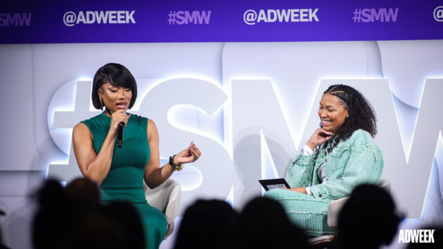
Editor’s Picks TV Upfronts Measurement Is Key to Make Streaming TV Ad Revenue Grow Even Faster By Mark Stenberg Social Media Week The Top 8 Retail Media Networks for Advertisers In 2024 By Kathryn Lundstrom ADWEEK BRANDED Marketers’ Most Burning Cookieless Strategy Questions, Answered Quantcast Sports Marketing News John Deere Seeks a ‘Chief Tractor Officer’ to Be the Face of Its TikTok Channel By Samantha Nelson Summer Olympics WBD Makes Strategic, Data-Driven Ad Sales Hire Ahead of Upfront By Bill Bradley BRANDSHARE FROM EPSILON People-Based Intelligence Is the Key to Driving Reliable Retail Media Outcomes Best of Social Media Week Social Media Week Creators and Strategists Say These Are the Social Trends to Watch By Trishla Ostwal Social Media Week How LTK Powers Seamless (and Lucrative) Deals for Creators and Brands By Kathryn Lundstrom Social Media Week Reddit’s CMO Busts Platform Myths By Lucinda Southern Creativity x Culture Megan Thee Stallion’s Advice to Next Gen of Creators: ‘Don’t Be a Walking Commercial’ By Luz Corona Magazine View All Super Bowl Commercials Inside the Audacious Attempt to DoorDash the Entire Super Bowl By Jameson Fleming Super Bowl Commercials Super Bowl 58 Business Influence Reaches Far Beyond Game Day By Jason Notte Super Bowl Commercials The Business of the Super Bowl By Adweek Staff Data Points Infographic: Making a Memorable Super Bowl Ad By Eva Kis The Adweek Resource LibraryBe a better marketer and get access to the latest Adweek-created guides, exclusive research, and sponsor white papers.See What’s New